Saturday, November 29, 2014

Fantasy Avatar Project

Original Photograph
 

          For my Fantasy Avatar, I started with a photograph I found online (I had hoped to use a photograph of my daughter, but did not have a good digital camera available).  I found out later that this is a photograph of a Hungarian actress.

        For the eyes, I followed the steps outlined in the Avatar Na’vi – Photoshop CS6 Tutorial, including feathering, moving the reference point, and increasing the size to 116% width & height.  The nose was flattened and elongated using the bloat and warp tools.  The color of the irises was changed by adjusting hue/saturation, brightness/contrast, and color balance.  Her skin color and texture, lips and sparkle effect were also achieved by using the guidelines in the tutorial.  For the markings on her skin I decided I did not want to utilize the same type of markings used in the tutorial, so I used a tattoo template, and modified it to remove extra components that weren’t needed.  I added the tattoo below her neck as a final touch as I thought the composition could use a bit more detail.  A photo of a rainforest was used in the background, with a dark vignette effect around the border.  I’m not entirely satisfied with the transition around her hair - and need to hone my skills in this area - but overall I am pleased with the result.
 
Final Image - Fantasy Avatar


http://allstarpics.famousfix.com/pic-gallery/andrea-osvart-pics.htm


http://www.tattoosdaily.com/tribal-tattoo-designs/


http://previews.123rf.com/images/pixxart/pixxart1202/pixxart120200015/12487336-tribal-butterfly-tattoo.jpg


http://tourists360.com/tropical-rainforest/

Sunday, November 23, 2014

Fantasy Avatar Project - Sketches & Concepts

For my avatar, I plan to begin with a photograph of a female - perhaps one of my daughter Kate.  I'm undecided about the embellishments to her skin, but like the idea of doing something less like animal markings and more along the line of a henna tattoo effect.  Adding fantasy elements such as elf-type ears and unusual texture in the hair would be something I'd like to experiment with as well.  This project is way outside my comfort zone, and I'm anticipating it will be the most challenging for me so far.

Tuesday, November 18, 2014

Vitamin String Quartet Book Cover


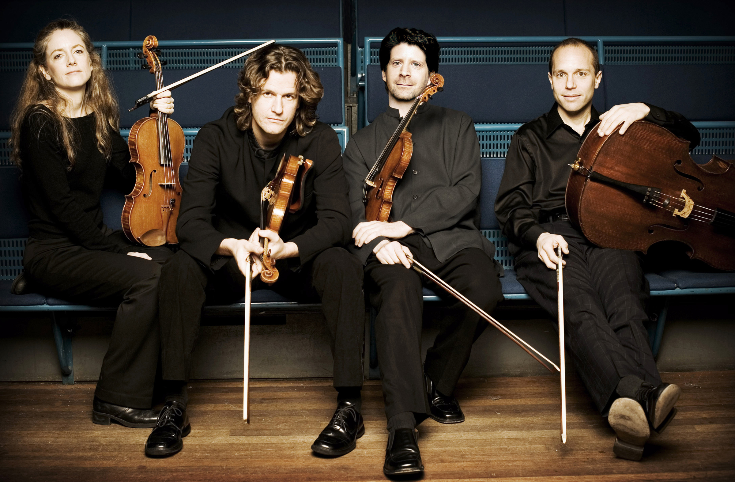
For this project, I decided to feature a group of classically trained musicians who play covers of pop and rock hits; the Vitamin String Quartet.  I liked the idea of melding both traditional and contemporary elements in the composition, much like what the group itself represents.

I chose an interesting photo featuring a group of youngish musicians to represent the group (the members of the Vitamin String Quartet are actually an ever-evolving lineup).  I used the blue/green color from the bench the group is seated on as the base color for the sound wave in the title, used a levels adjustment layer, and filters to enhance it. I decided black would be an ideal base color as it would work well with the photo and blue/green components I incorporated, as well as white text. On the back cover, a simple graphic with a curve reminiscent of a stringed instrument was used. 

Sources:
http://www.allmusic.com/artist/vitamin-string-quartet-mn0001002995/biography
http://www.vitaminstringquartet.com/
https://news.uns.purdue.edu/images/+2006/convos-quartet.jpg
http://tomcobbcreations.files.wordpress.com/2013/11/sound-waves.jpg
http://pichost.me/1711375/

Thursday, November 6, 2014

Vitamin String Quartet Book Cover - Sketches & Concepts


     The classical/jazz/folk artists I chose for the book cover project is the Vitamin String Quartet.  This group is difficult to describe, but essentially they are a group of classical musicians who play rock and pop hits.  Music by Vitamin String Quartet is featured in a current Target commercial:
     Because this group is a fusion of classical string instruments and rock/popular music, my goal is to combine traditional with edgier graphics.
     I would like to feature stringed instruments, either as the primary feature on the cover, or incorporated in a loose line drawing or within silhouettes of musicians.  Another idea that appeals to me is to use a bold color on black as a visualization of sound waves, and have the text appear within the "noise" of the graphic.  After viewing the Photoshop Creative Effects and Filters course, I was particularly intrigued by sketch effect, crystallizing pixel effects, surface blur, film grain and vignette effects.  I look forward to experimenting with them to come up with an interesting result.
Book Cover Sketches 1
Book Cover Sketches 2
Project Concepts Module 4


Sunday, October 26, 2014

Autism Acceptance/Neurodiversity Poster


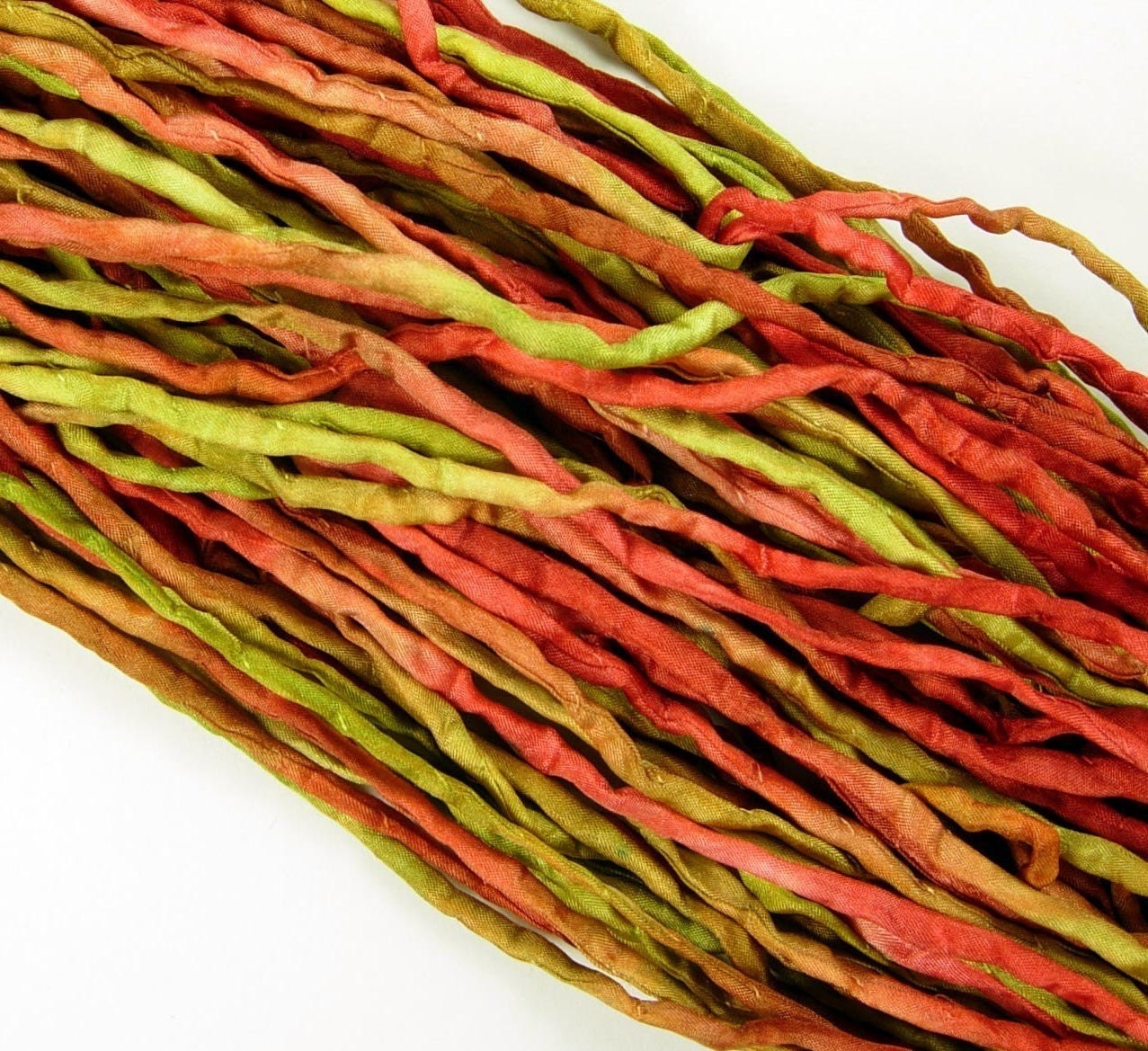
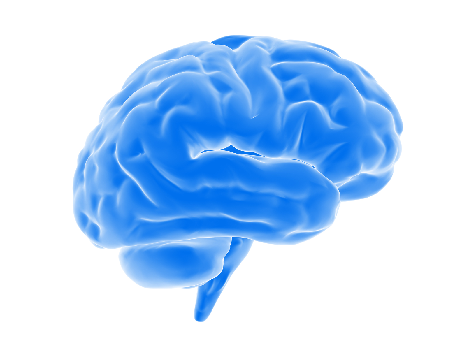
     I decided to use the Neurodiversity concept for my awareness poster, because I was excited that it offered an opportunity to do something clean and modern, and quite different from my previous project.  I changed the text message slightly, but pretty much kept the layout the same as my original concept sketch. I wanted to make the colorful brain be the most visually interesting element of the composition, with the text being secondary.  My intention is that when someone looks at the poster, the brain image will grab their attention and arouse curiosity about the meaning, prompting them to explore further.  I kept the text itself fairly simple, and only added a subtle bevel and drop shadow effects.  The brain was created using multiple photos of ribbons and cords with varying opacity, and adjustments to the vibrance.  My original plan was to keep the background of the composition white, but after the main elements were placed, I felt it was too stark.  I decided to add a color blocking on the top and bottom to highlight the text and give it a bit more impact, yet be understated enough not to compete with the main brain image. 

Sources: 


Thursday, October 16, 2014

Autism Acceptance/Neurodiversity Poster - Sketches & Concepts

Awareness Project Sketches 1


Awareness Project Sketches 2

Awareness Project Concepts

My goal for this project is to bring awareness to a subject that many people may be unfamiliar with - autism acceptance & neurodiversity, which I explained at length in my discussion post. This issue is important to me personally, as I have a wonderful daughter who happens to have Asperger syndrome. I would like to incorporate a simple phrase or quote with photos and graphics that enhance the message of autism acceptance.  I'm unsure which concept to move forward with because I would love to explore them all.  The concept on the upper left is appealing because it would be more graphic and modern.  It would be interesting to experiment with unique ways to depict the diversity of our minds using an image of the brain, but rendered in a creative way.  I also like the idea of using images of children, as bullying is an important issue and I would like the message to reach both younger and older individuals.   I would appreciate any feedback/suggestions you all have to offer about which concept you feel would be most impactful and effective.
 
Thanks,
Jeannie


Sunday, October 12, 2014

Photomontage (Part 2): Magpie

Creative Project: Photomontage (Part 2)

 
My photomontage concept for the artist/band was largely based on one of my sketches, with some modifications.  I wanted the aesthetic to be a mix of mystery, fantasy and grunginess. 
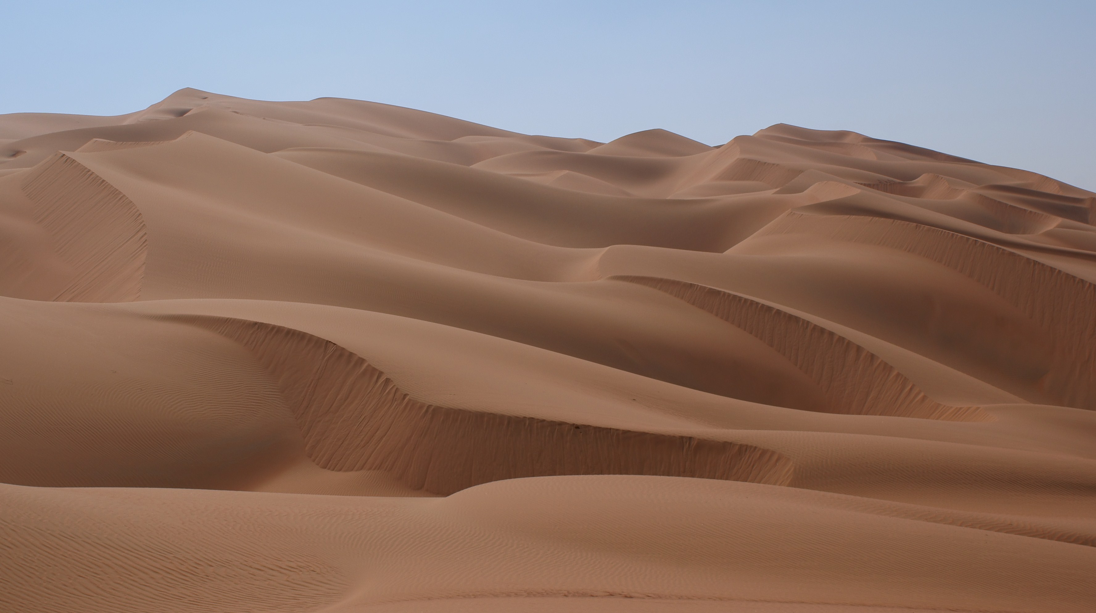
I started with a desert landscape background, and experimented with the brightness/color and hue/saturation, in an attempt to create a fantasy feel, but ended up deciding that the original worked well.  A rock formation image was added beyond the horizon to bring in some interest and sense of depth to the landscape.  I then used an image taken underwater to overlay the sky to give it more texture and movement, and also retained the water layer over the rock formation, because I liked the tones and texture it added.  Adding the guitar element was complicated.  My original plan was to have it in the forefront (going through the window), but after experimenting with placement and not feeling pleased with the result, I decided I was content with it being on the other side of the glass, within the background. I faded the far end of the guitar neck to blend into the desert dunes.  An image of a broken window was added next, and I removed some of the cracked pieces to reveal more of the landscape environment beyond.  The opacity of the glass was adjusted, and I added a scratchy, grungy filter to the window frame.  The diagonal black/brown streak on the left side of the photo was actually a branch in the original window image.  My plan was to remove it, but after working on the image I decided I liked that it appeared to be a tear or damage to the image, which worked with the worn feel I was going for. I thought about maybe adding more scratches to balance it out, but then decided against it as I wasn’t entirely sure of the best method to achieve it, and was pretty satisfied with it as it was.  The placement of the water drops is also something that developed as I worked with the image.  I originally thought I would just use the rain droplets on the glass, but then kind of liked having it throughout the image to make the photomontage more surreal.  I wanted the image to look a little darker around the perimeter to help blend the window frame with the image, so I made a vignette using the ellipse marquee tool and feathering. For the text for the name of the band/artist, I created a copy underneath the original, and applied Gaussian blur, to create a shadow to make the text stand out a bit more. 
I’m happy with the finished result, and feel that the open ended nature of this project gave me lots of freedom to experiment with many different techniques.   I think my photomontage is effective because I incorporated musical imagery in a subtle way, and the end product communicates a gritty impression which I believe is the appropriate feel as the montage represents a creative entity - artist/band.

Photo Sources: