 |
| Creative Project: Photomontage (Part 2)
My photomontage concept for the artist/band was largely
based on one of my sketches, with some modifications. I wanted the aesthetic to be a mix of
mystery, fantasy and grunginess.
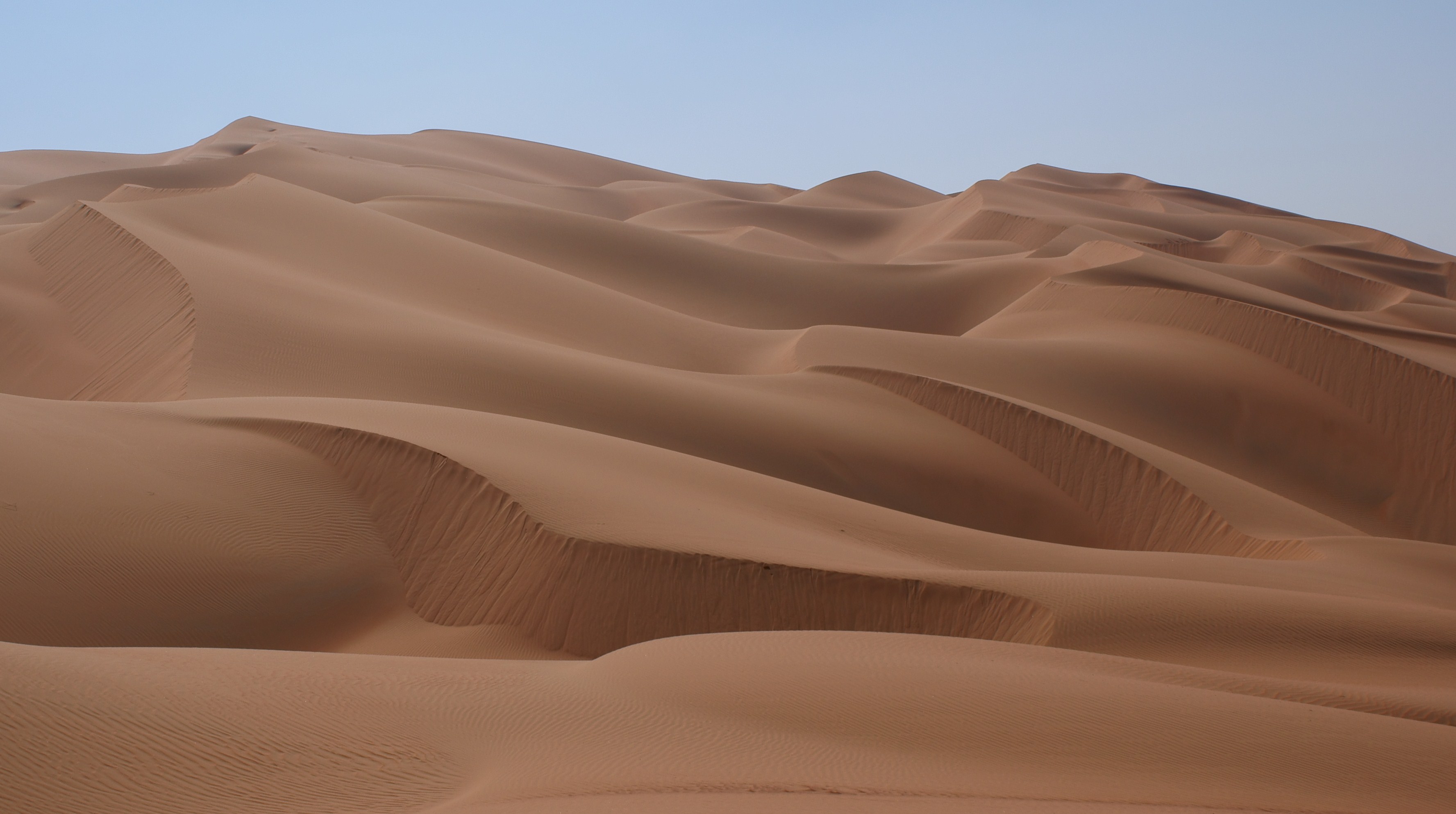
I started with a desert landscape background, and
experimented with the brightness/color and hue/saturation, in an attempt to
create a fantasy feel, but ended up deciding that the original worked well. A rock formation image was added beyond the
horizon to bring in some interest and sense of depth to the landscape. I then used an image taken underwater to
overlay the sky to give it more texture and movement, and also retained the
water layer over the rock formation, because I liked the tones and texture it added. Adding the guitar element was complicated. My original plan was to have it in the
forefront (going through the window), but after experimenting with placement and
not feeling pleased with the result, I decided I was content with it being on
the other side of the glass, within the background. I faded the far end of the
guitar neck to blend into the desert dunes. An image of a broken window was added next,
and I removed some of the cracked pieces to reveal more of the landscape
environment beyond. The opacity of the
glass was adjusted, and I added a scratchy, grungy filter to the window frame. The diagonal black/brown streak on the left side of the
photo was actually a branch in the original window image. My plan was to remove it, but after working
on the image I decided I liked that it appeared to be a tear or damage to the
image, which worked with the worn feel I was going for. I thought about maybe
adding more scratches to balance it out, but then decided against it as I wasn’t entirely sure of
the best method to achieve it, and was pretty satisfied with it as it was. The placement of the water drops is also
something that developed as I worked with the image. I originally thought I would just use the
rain droplets on the glass, but then kind of liked having it throughout the
image to make the photomontage more surreal. I wanted the image to look a little darker
around the perimeter to help blend the window frame with the image, so I made a
vignette using the ellipse marquee tool and feathering. For the text for the
name of the band/artist, I created a copy underneath the original, and applied Gaussian
blur, to create a shadow to make the text stand out a bit more.
I’m happy with the finished result, and feel that the open
ended nature of this project gave me lots of freedom to experiment with many
different techniques. I think my
photomontage is effective because I incorporated musical imagery in a subtle way, and the end product communicates a gritty
impression which I believe is the appropriate feel as the montage represents a creative entity - artist/band.
Photo Sources:
|
Sunday, October 12, 2014
Photomontage (Part 2): Magpie
Subscribe to:
Post Comments (Atom)
No comments:
Post a Comment