
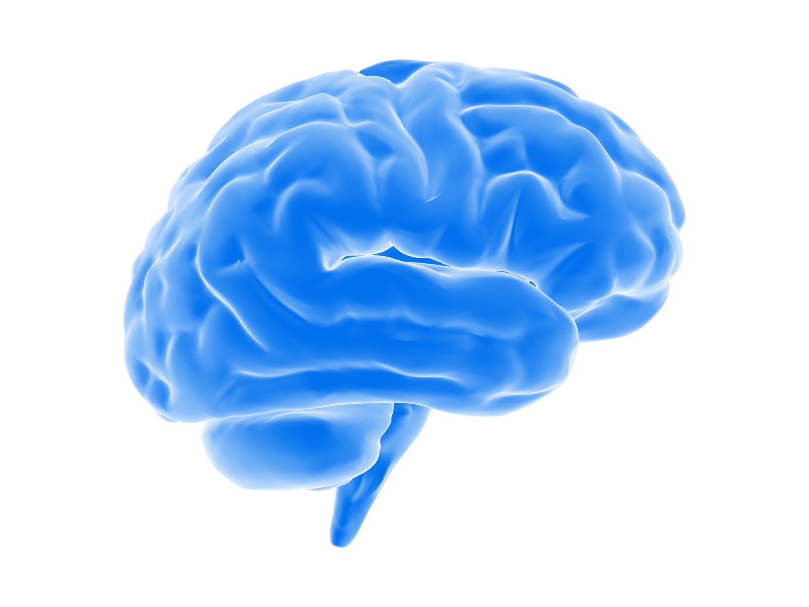
I decided to use the Neurodiversity concept for my awareness
poster, because I was excited that it offered an opportunity to do something
clean and modern, and quite different from my previous project. I changed the text message slightly, but
pretty much kept the layout the same as my original concept sketch. I wanted to
make the colorful brain be the most visually interesting element of the
composition, with the text being secondary.
My intention is that when someone looks at the poster, the brain image
will grab their attention and arouse curiosity about the meaning, prompting
them to explore further. I kept the text
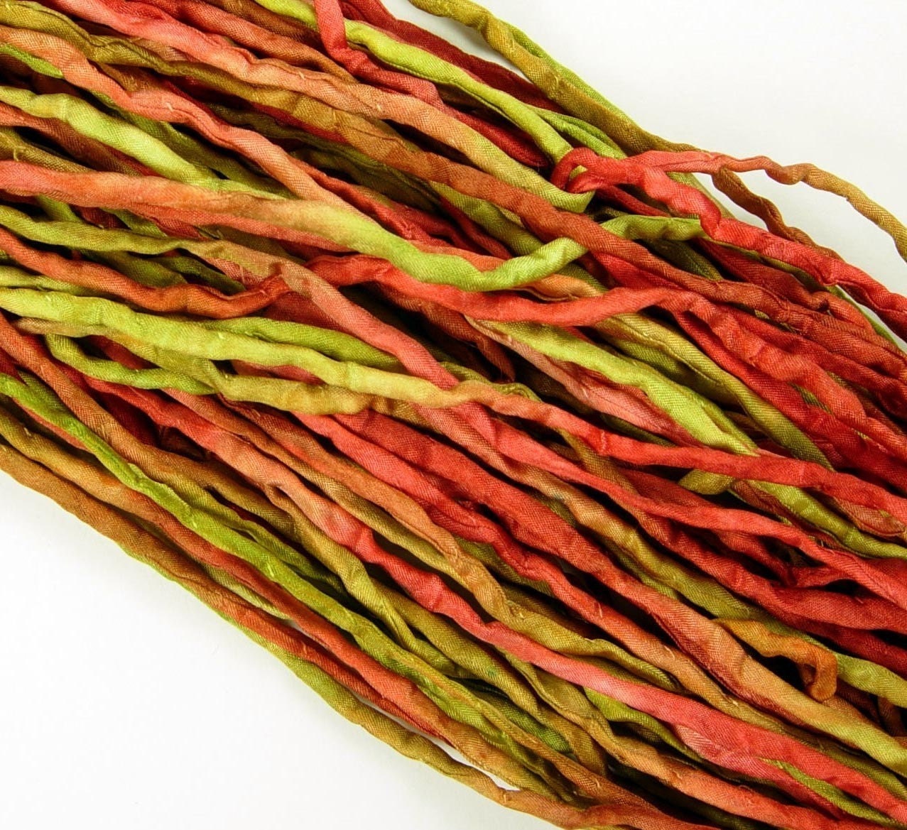
itself fairly simple, and only added a subtle bevel and drop shadow effects. The brain was created using multiple photos
of ribbons and cords with varying opacity, and adjustments to the vibrance. My original plan was to keep the background
of the composition white, but after the main elements were placed, I felt it
was too stark. I decided to add a color
blocking on the top and bottom to highlight the text and give it a bit more
impact, yet be understated enough not to compete with the main brain
image.
Sources:
http://archive.anthonymattox.com/2007-2011-blog/wp-content/uploads/2010/10/particles_ribbon-1901.jpg


